The first website that i would like to talk about is, http://www.texelate.co.uk/.
This website has a very clean feel, its not to cluttered, the colours used in the website such as the header, are only colours used in photographs on the main page of the website, wich both in turn complement each other.
Another thing i like about this website is the fact that the designer has made the header and footer really dark, grey/black, while keeping the main part of the website as a very pale blue and white, i think the big contrast in colours work well together and help the website look really sleek and clean.
The second website i would like to talk about is called http://www.spoongraphics.co.uk/.
The header of this website is relatively similar to the previous website, however this website uses a light brown colour scheme, and in turn uses less colours on this website, i think this works even better and helps the website look clean and clear.
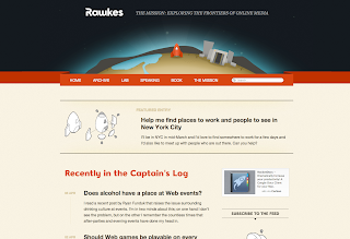
The last website that i am going to talk about is http://rawkes.com.
I personally prefer websites that have the navigation bar a little lower than right at the top of the page, with the navigation bar been closer to the content itself, it is less time and effort the user has to put in to navigate to where they want to go.


